How We Did The Slide Shows
1) Images
Ultimately ALL slides must be horizontal and 640x480 pixels
FREE SOFTWARE that can help:
All platforms: GIMP: a somewhat of a high-end, photoshop like program that takes some getting used to.
Windows Only: Irfanview: fast - easy program, lower learning curve, but somewhat limited, enough most of the time.
2) Text

Either program above (plus tons of other image editing programs) can add text to images. Text helps define what the image is.
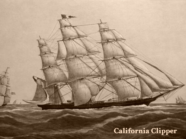
This slide (at 50% size) was used in "The Posse" video-podcast to illustrate how half the people coming to California at the time of the story got here and why lighthouses were critically needed.
Text can be on the image or below the image, as in "Wrecks". In fact, in the Wrecks slide show, text dwarfed the image itself (which then did not need to be 640x480).
Not every slide needs text. For example in the "Postcards" slide show, text was not needed. It would have been useful to know the year the postcard was made, but this was not known.
3) Theme (Title)
I would hope this is self evident. The slide show has to hold together. Even slide shows that appear to be random images, like "Visitors" or "Inside", still confine the subject by their titles. Remember, you are not limited to just one slide show. I put together a large collection of images before I even started.
4) Number of slides
It is not a slide show with only one image. The other extreme, it can get tedious, if there are hundreds of images. People have VERY SHORT attention spans in our modern culture. Keep it short, sweet and beautiful.
5) Putting it together
This is the easy part (for you at least). I put them together and place them on the lighthouse website. All I need are the images, a title and any explanatory text you want included with it (text under the entire slideshow). It is helpful if you let me know the order you want them in, either by labelling the images (ie. 01.jpg, 02.jpg, etc.) or a list of the slide names in your email in the order you want.
This is meant to be a collaborative effort. We work together. No one has to do it all. Whew!
